This or that? What’s the “beast”? What’s missing?
Here I am back with my late-night musings on the “UXless” (yes the typo is intentional) questions I am seeing more and more of on social media.
Young and old UI/UX/CX wannabes alike looking for an opinion on whether this or that version of a button, interface, menu, or whatever is better.
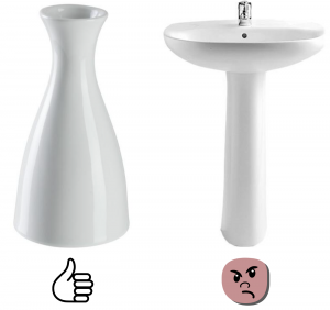
A bar chat and under the post, like any good bar chat, hundreds of opinions (some even expert) about which version is actually better…and comments flood.
Now, aside from the fact that personal taste is one of the “diseases” of the designer (even an expert) but actually 99% (someone is honestly there who remembers it) questions like that are completely useless because the biggest element is missing: context (this unknown)
But what is the context?
The concept of context, despite being known to all summarily is often forgotten in its essence:
the context is the reference; the context sets the rules of the game.
Of what?
Our brain, due to evolution, is used to evaluate every single element alone and positioned within a scene.
Our brain evaluates, anticipates, predicts (to protect us), and sometimes even makes mistakes (optical illusions, false alarms, Deja Vu).
In short, any evaluation we are asked to make OUTSIDE the environment in which it is naturally or artificially (like a UI) placed is often useless without the context.
Our brain also accepts unnatural, artificial, imaginary context BUT once the “roles” are set, it searches for reference, comparison, coherence with roles the context has previously set: (i.e. Superman can fly BECAUSE narration says he comes from another world…where everyone has superpowers).
Our brain, in the end, doesn’t like so much the tricks. 😉
Can Context be an enemy?
Some time ago I noticed the Adobe Acrobat icons (see picture) and wondered how the heck it was possible to represent that way (in order):
(1) Edit PDF, (2) Adobe Sign, (3) Signature
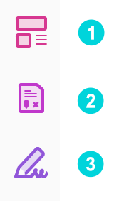
with such peculiar icons (even the (1) completely sci-fi!).
Raise your hand if you haven’t thought of representing the EDIT of a document or form with a pen or pencil (me!).
But here the damn (blessed?) context would have potentially caused a disaster!
Edit -> Pen, Sign -> Pen, Certify with signature -> Pen!
Imagine now if Adobe had asked, “ which pen is more accurate?”
Nonsense. What’s missing? (Yes! Got! the context!)
Moral (as always I use to do):
When we happen to represent a concept or a message let’s see it in the possible contexts:
what does the pen have around it?
where is the pen positioned?
what did the user do before the pen came out?
at what stage am I showing the pen?
have I represented the pen for something else?
and finally, we test with users because surprises are always around the corner and, …
…what’s around the corner? 🙂
Adobe (hope they will not blame otherwise I send them a resume)
Vega Vase from https://www.vega-direct.com/en-us/vase-vaza-122047 (I link for free I didn’t receive any tips…)
Sink by: https://www.eprice.it/Vasi-WC-Bidet-Lavabi-Bagno-Italia-Lavandino-A-Colonna-Da-50-Cm-Monoforo-Ceramica-Stile-Classico-Bianco-0797337286688/d-57622868 (still no money for linking 🙂 )